CD Booklet Analysis
GDragon's Heartbreaker album booklet gave me a lot of inspiration and ideas for the graphics of my website. I analysed the CD booklet and noticed many elements such as the typography, colour palette, objects which consituted the overall style of the album. I also looked at the composition and arrangement of the objects in the booklet and this is how it has influnced my web design.
Analysing the content, typography and layout of the CD booklet would be helpful as a guide so when creating the website I will be familiar with the style of the CD which will help create a concept to base the website on. GDragon's Hearbreaker has a distinctive quirky and edgy style, the graphics incorporate a sense of fun and is represented visually through the booklet.
CD booklet scans
Below are the scans from the booklet

Concept & style
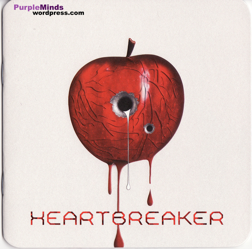
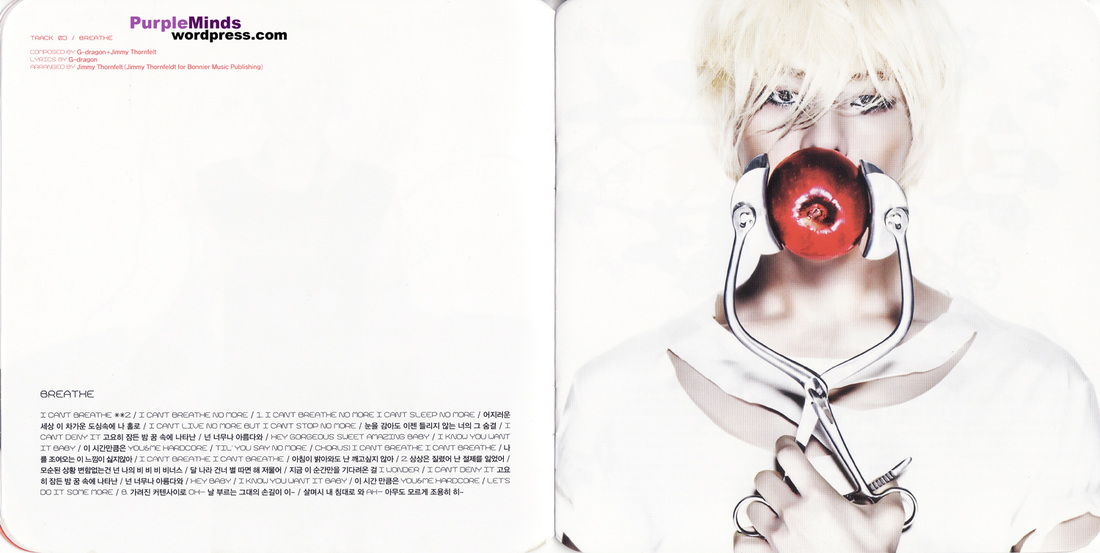
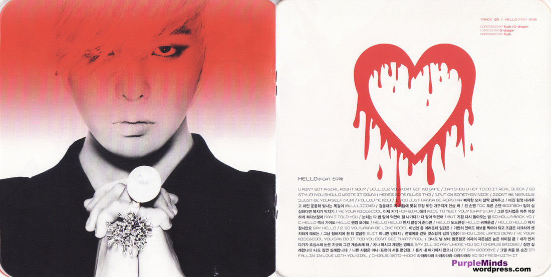
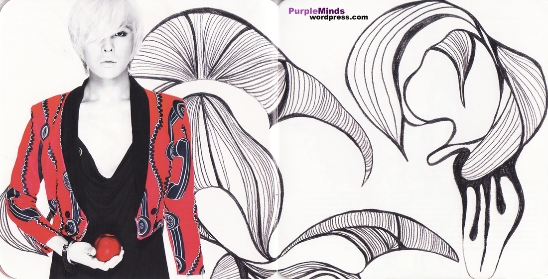
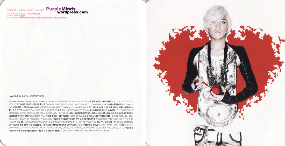
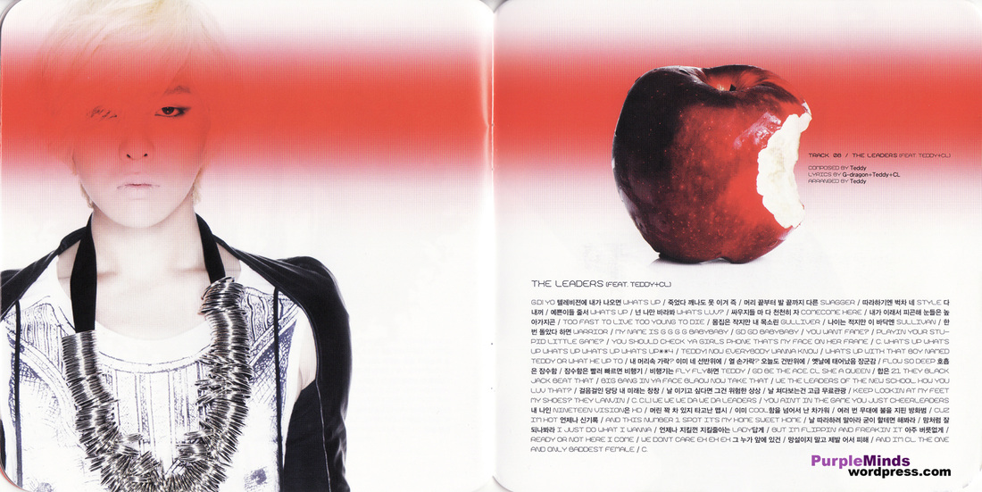
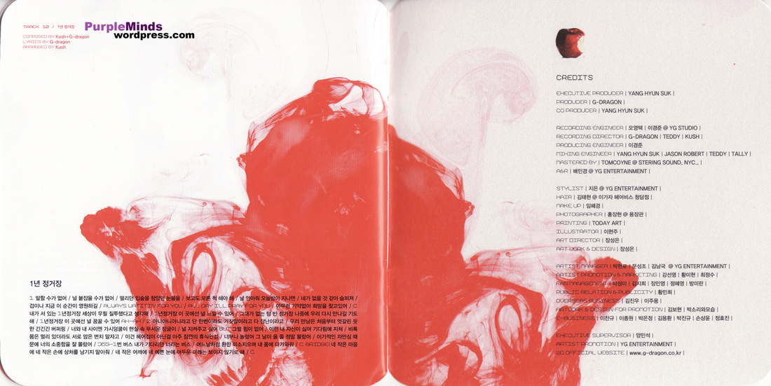
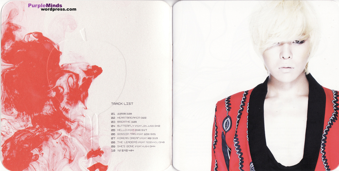
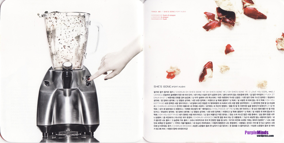
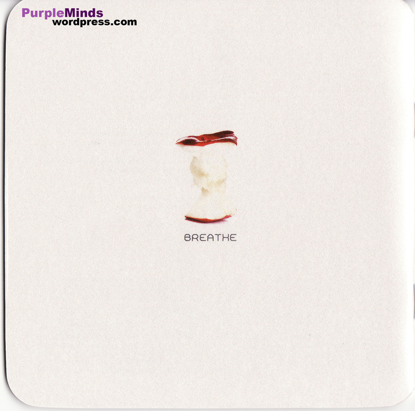
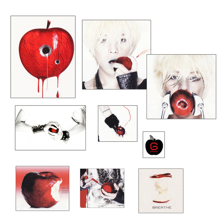
The concept of the album is about representing the feeling of being 'heartbroken' visually, as this feeling is felt and not seen. I think it is creative and unique the way the theme of being heartbroken is portrayed through the images. Example include apples; we can see that apples are prevalently used in the booklet and they symbolise the heart.
Apples
Apples are present in most of the pages in the CD booklet as we see the apple with gun shot wounds, apples with 'blood' dripping from them, bitten apples and crushed apples in the blender. All this is done to give the message that GDragon's heart is being played around which relfects the lyrics of the song. Below I have gathered images from the booklet to show this.
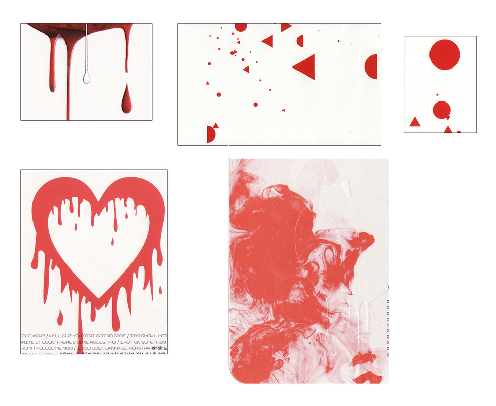
'Blood dripping'
There are many pages which graphics of the heart 'bleeding' indicated by the objects supposedly dripping with blood' as though they are melting. Also implying how someone would feel shattered when they are heartbroken, the scatter of shapes on one page shows feeling disoriented. It would be interesting to use splats of red or black on my pages to portray this feeling.
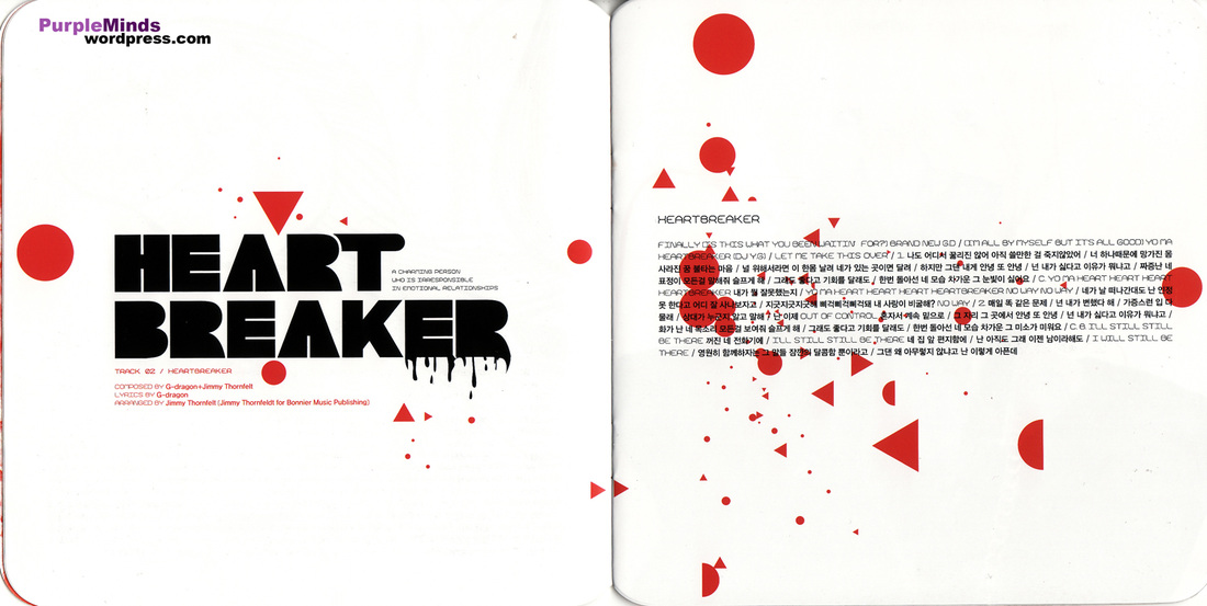
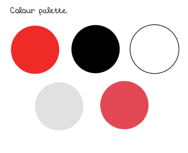
Colour Palette
The main colours for the 'Heartbreaker' concept and in the CD booklet inlcude red, white, black, grey which fits in with the theme.
Type Face
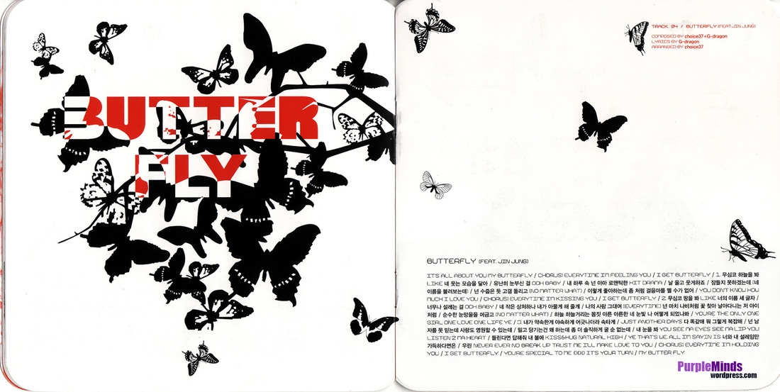
Doing some research, I discovered that the type face used in the album's graphics is called 'Kimono Geo', I liked the jagged style of the letters.